Appealing to color science is a reliable approach to alienating associates, customers, and jurists; you’re telling them they can’t trust their own eyes.
The damnable problem is that this claim is absolutely true and is endorsed by psychologists, optometrists, color scientists, etc.
Visual photonic, physiologic, and psychologic processes are shockingly complex, as is digital imaging science (our industrial generation of visual experiences). This tends to discourage engagement.
One of the most potent demonstrations of the problematic use of color exists in the discipline of thermography, that is the use of cameras sensitive to infrared rather than visible band electromagnetic energy. That invisible energy must be translated to visible band artifacts for humans to view, and that translation is mathematically and cognitively perilous.
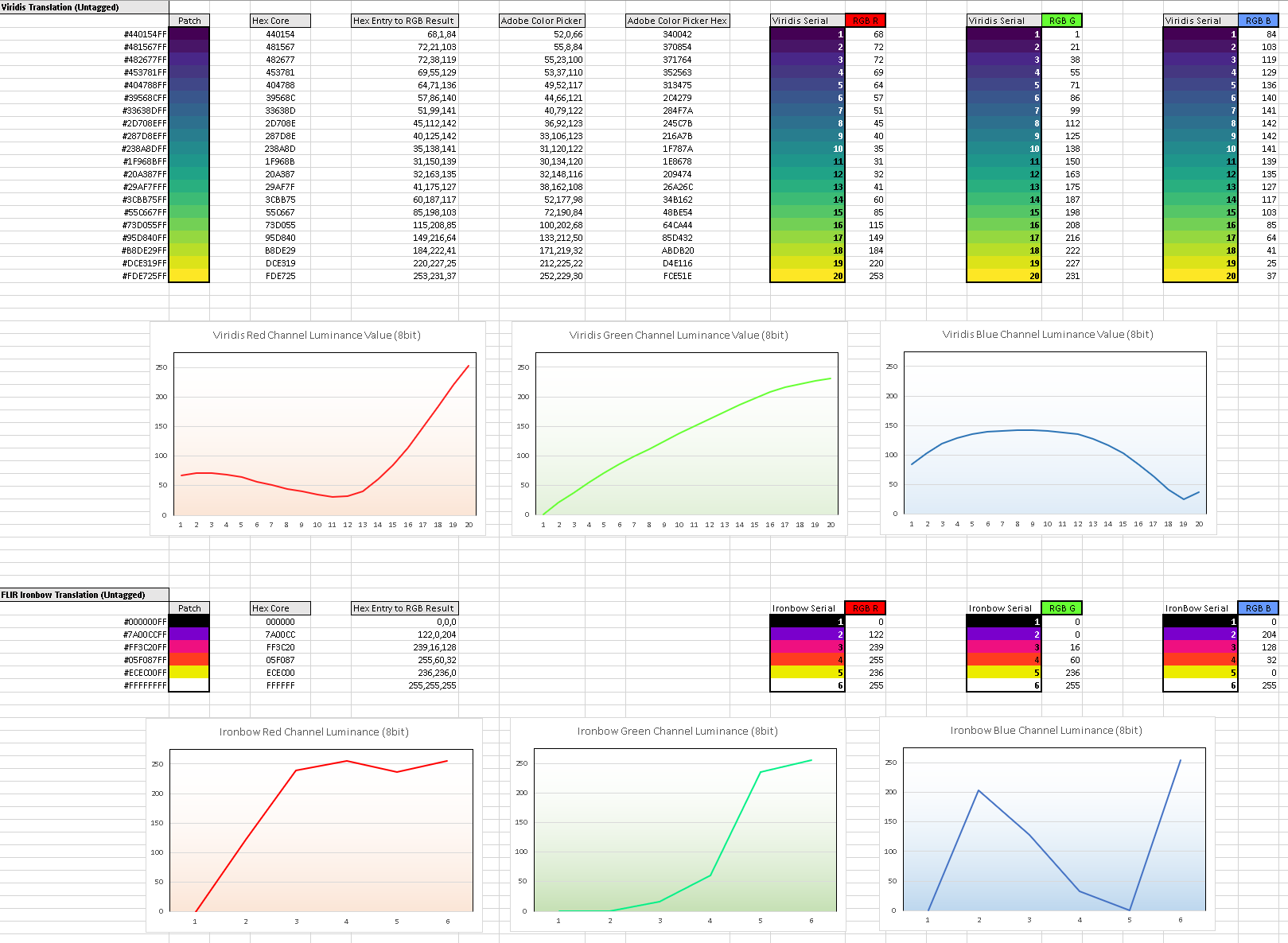
The preceding diagram illustrates the differences between two color mapping schemes. The top red, green, and blue channel graphs are a forensically defensible color mapping schema that is perceptually uniform and “robust to colorblindness.” Perceptual uniformity is critical in qualitative visual assays.
The bottom three channel graphs are a common color mapping schema for thermography, “Ironbow.” Note that the color mapping is radically different between the two procedures.
It is reasonable to ask, “so what?”
The most direct answer is to explain that color error in human vision is common; not necessarily complete “color blindness” (achromatopsia), but assorted versions and magnitudes of variable color sensitivities. Two of these dyschromatopsias are so relevant in the imaging and graphics worlds that Photoshop maintains a top-level menu item for “proofing” output germane to them.

Another relevant concern is that while digital imaging is formulated upon a trichromatic theory (red, green, and blue), human vision is not.
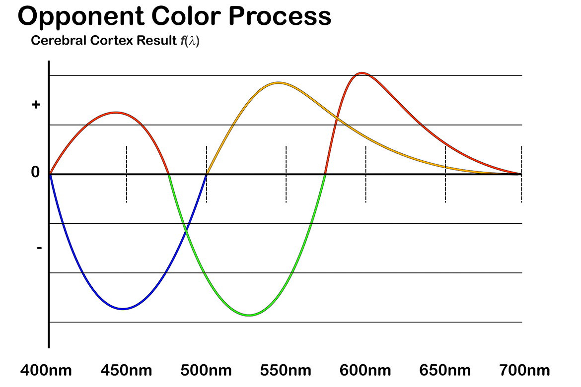
The common model of human vision is predicated upon an “Opponent Color Process” that is functionally distinguishable from the classic trichromatic theory; the above graphic exhibits an obvious juxtaposition of blue v. yellow, and green v. red. This diversity is not without material consequences in the digital and computer science realms.
Spatial and temporal parameters are just as complex as colorimetric concerns. If you’d like to test those waters buy a book on “The Visual Process” and look into Receptive Fields, Lateral Inhibition, and Phototransduction.
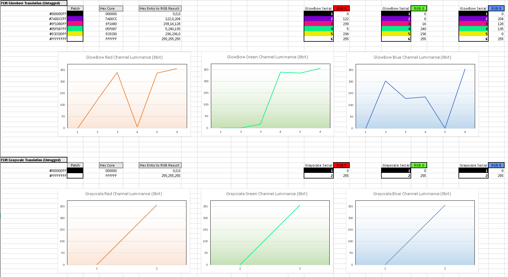
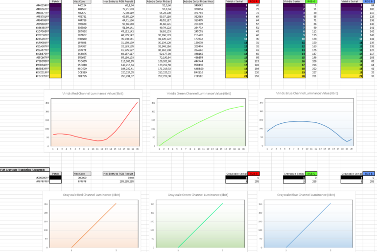
A grayscale palette may be considered somewhat more objective than an aggressively colored palette but has its own insufficiencies. The preceding diagram illustrates the differences between two additional color mapping schemes; the top red, green, and blue channel graphs are another common color mapping schema for thermography, “Glowbow.” The bottom three channel graphs are the common grayscale mapping schema for thermography, “Grayscale,” with a “white = hot” distribution.
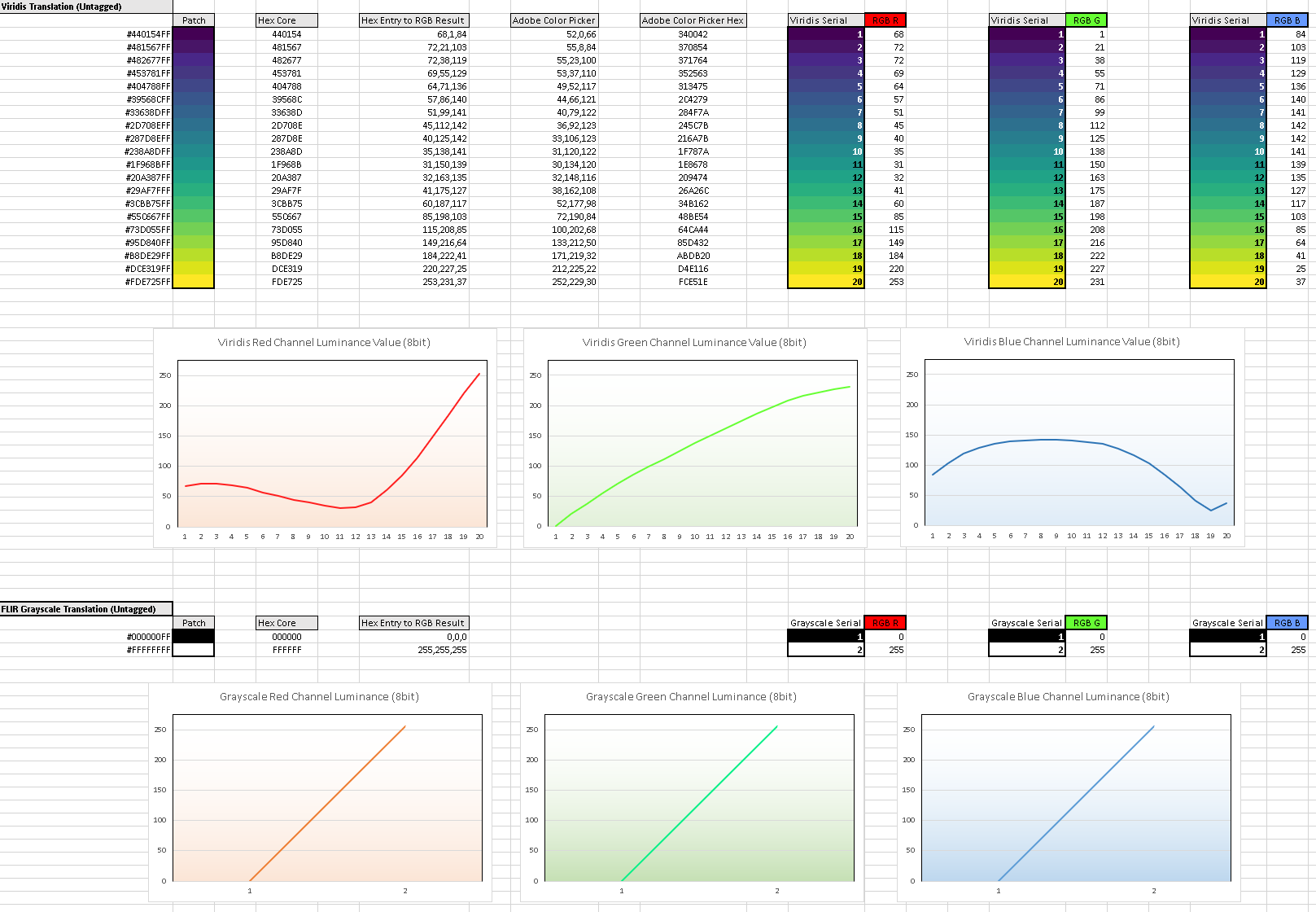
Comparing the grayscale to the perceptually uniform standard (above) illustrates why simply linear solutions aren’t necessarily a therapy; the mapping differences between the two schemes are quite obvious.
This also begs a question concerning human visual acuity; humans are able to discern perhaps 200 levels of grayscale, somewhat shy of the 256 levels mathematically specified by the 8-bit image file standard and without a terribly strong correlation to any particular monitor performance or operation, particularly in non-color managed environments.
Beneath these concerns lie very real image compression concerns and uncertainties of assured visual acuity for triers of fact.
Color in thermography is problematic.

In the above graphic details in the lower right quadrant of the frame are mitigated in “Ironbow” but well-defined in the “Grayscale” and “Viridis” treatments. The details (not the color) of the “Grayscale” and “Viridis” treatments should be virtually indistinguishable to observers with relatively standard vision.
L
